Skip to main content
Remarkety Responsive Design Tip: Design with All Screens in Mind
 These days, it’s not uncommon for someone to own a laptop, a smartphone and a tablet all at once. Moreover, it’s especially not uncommon for a single person to use all of these different devices throughout the day! Some people even go beyond this, with multiple phones and computers at their disposal. Needless to say, our eyes are on quite a few different devices at any given time, but mostly on our mobile devices.
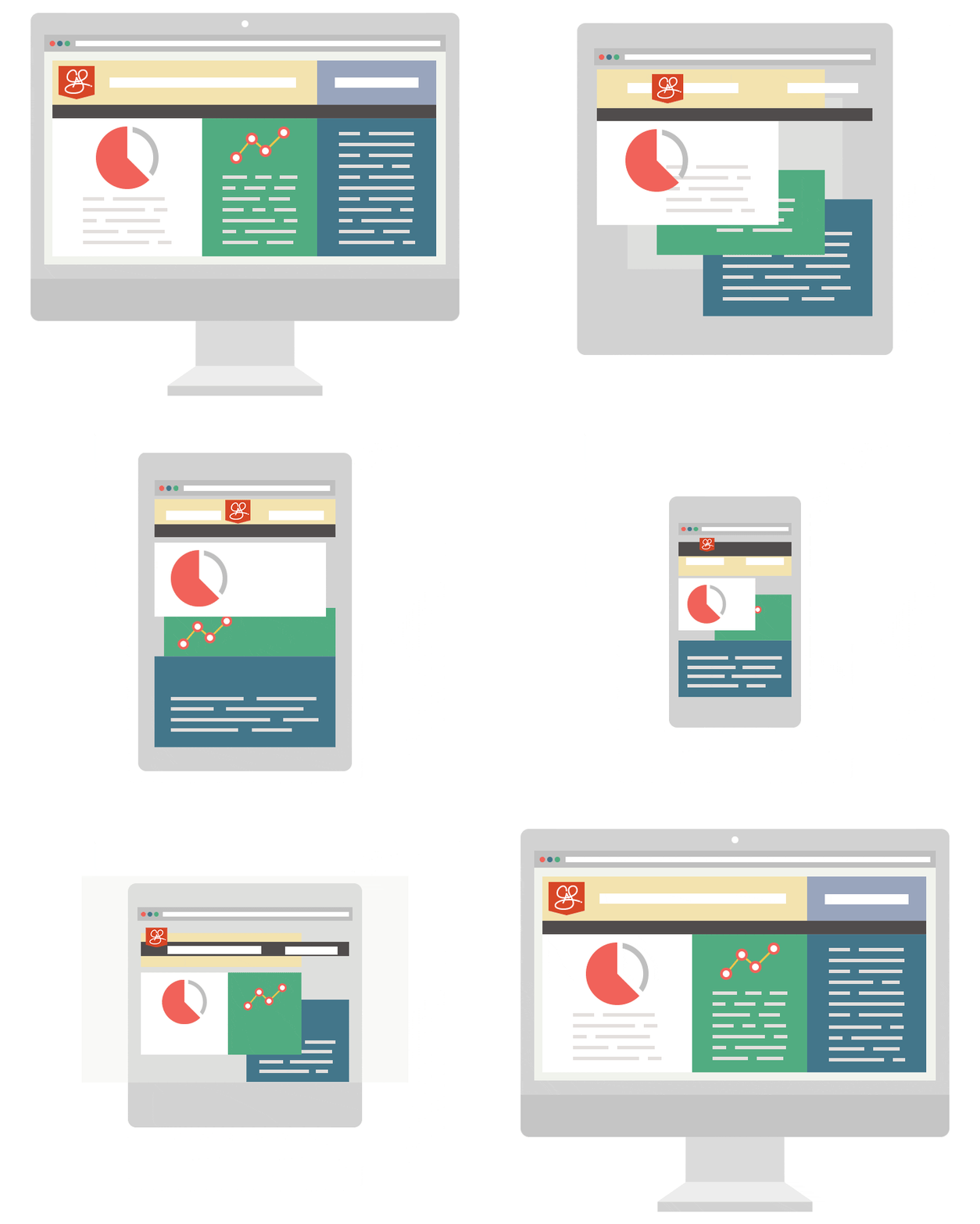
While diversification of devices has certainly enabled eCommerce websites to prosper, it has also created an abundance of challenges—namely when it comes to responsive design. Now, things like email need to be able to instantly detect the screen size of a device and react accordingly to resize… all without disrupting the content or message. As you may have guessed, errors in this process are common.
If your eCommerce’s email isn’t optimized for instant adjustment based on a recipient’s device, you can pretty much count it as a dud. Your recipient isn’t going to spend time trying to decipher a jumble of pictures and text, and will simply hit the trash button. Responsive and mobile device must be at the core!

So what can be done to prevent a mistranslation of your email? How can you account for numerous screen sizes, without creating a message that’s impractical or unflattering? Remarkety offers a few simple solutions:
-
Preview: The first and best way to make sure your email message will flourish once it’s released is to test it at different screen resolutions. You’ll be able to see its adaptive process in real-time, to consider how it might be affected by a screen. If you find a problem or don’t like a display, it’s easy to flip back over to the Remarkety editing screen and make adjustments!
-
Dynamic code: Inserting pre-qualified snippets of code in your email will ensure it adapts to a screen in the best way possible. For example, if your dynamic snippet designates product recommendations, it’ll know to display more or fewer based on the available screen size. This means not having to adjust this manually if you have trouble with a particular screen size.
-
Low data costs: If you pack your email full of high-res pictures and heavy links, it’s going to take a while to load. Moreover, this time will vary by device—it might take seconds on a desktop, a minute or two on a tablet or way too long on a smartphone. Keeping your data cost low ensures that any device will be able to load the content quickly, regardless of what network they’re on or what speeds they’re getting.
The best thing you can do when designing with all screens in mind is to account for your message. Make sure it’s front and center, and easy to understand! You don’t know if your recipient is reading it on the bus, at work, lying in bed or somewhere else, or on what device they’ll open it. Keeping the bread and butter of the email “above the fold” and having a subject line that’s clear and concise will help prompt opens and clicks regardless of the device.
Never underestimate the power of responsive design, and never assume it’s perfect. Instead, use Remarkety to understand its many nuances and work to create better, more applicable emails no matter what device your customers are using. All of Remarkety’s templates are responsive and are optimized for best mobile experiences.
Make sure to schedule your free 1-1 demo or try take advantage of our 14 day free trial and enjoy responsive email marketing today!
 These days, it’s not uncommon for someone to own a laptop, a smartphone and a tablet all at once. Moreover, it’s especially not uncommon for a single person to use all of these different devices throughout the day! Some people even go beyond this, with multiple phones and computers at their disposal. Needless to say, our eyes are on quite a few different devices at any given time, but mostly on our mobile devices.


